Thursday, 23 May 2013


Today for visual communication class, I learnt how to use the Adobe Illustrator for the first time in my whole life! Honestly, it was a really challenging task, for I had no idea how to use it at all. But gradually, I slowly learnt how to create shapes and there is an unbelievable sense of satisfaction when I finally mastered how to do so after a seemingly long time. I really hope that in the days to come, I will be able to finally put what I have learnt into good use when I create illustrations on my own!
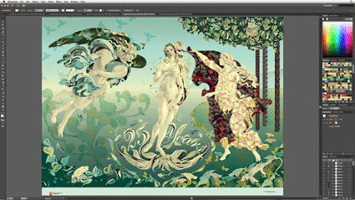
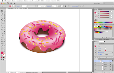
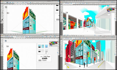
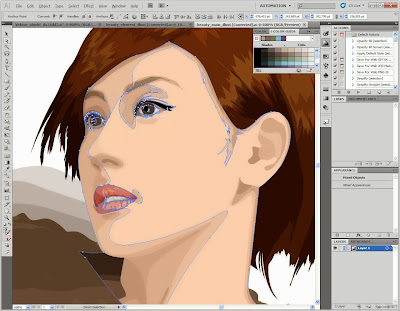
Anyway, here are some amazing works of art I found created with adobe illustrator! It will be amazing if I will be able to create something like that one day (:


Credits:http://www.creativepro.com


Credits:http://adobe-illustrator.en.softonic.com


Credits:www.creativepro.com

Credits:www.dewikimedia.org


Credits:www.aemcreativemaster.blogspot.com
Credits:http://gorsel.kindir.net/adobe-illustrator-cs5-2099.jpg


Friday, 17 May 2013

Here's my mood board showing the latest teenage fashion in Singapore! (:

During the visual communication lesson this week, I learnt more about design influences on contemporary designs, and also about art movements, such as cubism. It was such an eye opener to know how these designs came about, and the stories behind a work of art. One good example would be the 'Weeping Woman' by Pablo Picasso. Who would have known that the subject of the piece was actually his mistress Dora Maar, and he painted it to show the acrimonious and tumultuous nature of their relationship? 
Credits:www.aduckinherpond.com

Indeed, through visual communication, I have learnt to appreciate art and designs around me. Instead of looking at them at the surface , I have learnt to discover them at a deeper level by finding out about the inspiration behind the piece. It's somewhat like finding the unknown, for most pieces are so abstract that one cannot simply interpret the artist's intention just by looking at it.
Well, I've also learnt that one can discover new and intriguing things once we become more aware of our surroundings and things around us. Upon seeing a print advertisement, one does not usually think about the design concepts behind creating such an eye-catching piece of work.But now, I find myself scrutinising them and it is so surprising how many discoveries I have.
Take this advertisement for example;

Credits:Apple


The contrast of colours in the advertisement makes the product (in this case it is the iPod) stand out. Its a simple yet effective design, for one does not need much guessing to figure out what the advertisement is trying to sell. At the same time,  the vibrant pink colour gives a fun vibe to the whole advertisement. My guess is that it is targeted to a younger demographic and its trying to market the iPod as something that is trendy and cool.
Indeed, good designs can make the world so much more interesting, and I'm rather excited to create some designs myself. Who knows what I will come up with? (:

Tuesday, 14 May 2013

Stay awesome.

Yes, that is the name of my T-shirt brand. (: Some people may be wondering,' Why this name'? Actually, I chose this name not only because of its simplicity, but it communicates the philosophy of my brand. According to Oxford dictionary, the word 'awesome' means extremely impressive. This is my hope for the company, that the T-shirts that we produce will be awe-inspiring. In addition, there is another reason for my choice, and that is my hope for young people today.

These days, the media portrays the 'ideal look' for females as someone with immaculate features and an extremely thin frame. As for males, the perfect look is portrayed by someone with chiseled muscles, and stunning good looks. Well,the message communicated to us subconsciously is that if we do not look like that, we are not good looking enough. I suppose that is the reason in the increase of young people being stricken with eating disorders and going for plastic surgery to improve their looks. And to me, that is really something to lament about.

As such, I hope that through my brand, I hope to communicate the message that everyone is an awesome, unique individual. Instead of conforming to the norms of the society, I feel that all young people should express their individuality, and know that they are extraordinary. Well, this is because there is no one in the world that is the same as them! I also hope all young people will know that they are blessed with their own aptitudes and talents, and they should never feel that they are inadequate. (:

And to end this post, here's a beautiful song that I think sums everything up best.

Thursday, 9 May 2013

Visual communication lesson 2

Here are some examples of the principles of design that I learnt!

Balance: The subject is balanced by a shape at the side of the picture, making them aesthetically appealing.


Gradation: There is a gradation of colours from dark to light, producing aerial perspective.


Repetition: Varying the colours for the second picture makes it much more vibrant, and makes it more interesting to look at.
Repetition without variation

Repetition with variation


Contrast: The contrast of colours ( dark and light) makes the picture more captivating. For the first picture, the contrast of tones and colours brings attention to the subject of the piece


Harmony: The result of using similar colour and tones for a whole piece is a stimulating effect to the eyes.


Dominance: Making use of a dominant subject in the picture makes it more striking


Unity: There is a visual link to the objects in the picture, making it more comfortable to look, as opposed to when the objects are vertical to each other.


Thursday, 2 May 2013

Credits:Jonathan Mak.


Looking at creative designs like the one above, it has always made me wonder how people are able to use their creativity to create impeccable and mind boggling advertising designs. So, I was really excited about having visual communication class, as I will finally be able to learn how to create my own designs! However, when I heard that we were all required to draw, I was really petrified. I mean, I can't even draw to save my own life! That may be exaggerated, but honestly, drawing is the last thing that I am good at. 
But of course, it was good to hear that most creative designers for advertisements are not able to draw too (: I guess creativity is more important than artistic skills in visual communication.
Anyway,the first visual communication lesson was really an eye opener! It has been ages since I last drew, and I really had a lot of fun attempting ( though it was a failed attempt)  to draw my friend's portraits.  I also learnt many design concepts, such as making use of negative space, and proportion.It really reminded me of my lower secondary art lessons, where we were encouraged to come out with designs that were out of the box. 
And of course, I find visual communication really interesting, as it is worlds apart from more academic modules that we have to take, such as business.  In this module, I really hope that I will be able to learn more about creating designs for advertisements and campaigns, and hopefully, one day, I will find drawing to be a walk in the park!