Balance: The subject is balanced by a shape at the side of the picture, making them aesthetically appealing.


Contrast: The contrast of colours ( dark and light) makes the picture more captivating. For the first picture, the contrast of tones and colours brings attention to the subject of the piece


Gradation: There is a gradation of colours from dark to light, producing aerial perspective.


Repetition: Varying the colours for the second picture makes it much more vibrant, and makes it more interesting to look at.
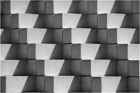 |
| Repetition without variation |
 |
| Repetition with variation |
Contrast: The contrast of colours ( dark and light) makes the picture more captivating. For the first picture, the contrast of tones and colours brings attention to the subject of the piece


Harmony: The result of using similar colour and tones for a whole piece is a stimulating effect to the eyes.


Dominance: Making use of a dominant subject in the picture makes it more striking


Unity: There is a visual link to the objects in the picture, making it more comfortable to look, as opposed to when the objects are vertical to each other.


No comments:
Post a Comment