Sunday 19 January 2014

Ways to make your design more memorable.

Having taken Visual Communication for close to a year now, I have definitely learnt and discovered many new things. Even though design is something that is daunting to me, I am glad to say that I have boldly taken up the challenges that have come my way, and created works beyond my expectations. So, I would like to share with you how to make your work more extraordinary.

Simplicity is key
Many may think that adding more things in a design will make it look more complex, and therefore more outstanding. However, I beg to differ as I feel that it will have the opposite effect instead. Just take the McDonald's logo for example. It is simply a logo of the letter 'm', or what others say, the golden arches. This timeless logo is something that can be identified instantaneously by someone as the company's icon, and this shows how effectual it is.

Appeal to emotions and tell a story. Give surprises.
Often, a good visual is one that can connect to us emotionally. Let's take the instance of an image of a malnourished African child. This appeals to us, as it a powerful image of how children like him are surviving on meagre amounts of food, making them skeletally thin.It also tells a story of them living in poverty. As the saying goes, a picture can speak a thousand words. In the same way, make your design impactful by using images which will evoke the desired emotions from people viewing it. Also, if your design has an element of surprise, people will be more likely to remember it.


Some designs I feel that are really good:
1) Ad to raise awareness of the dangers using phones while driving
Credits: http://wp.streetwise.co/wp-content/uploads/2012/03/Image-via-Fubiz1.png
2) Ad that brings to attention the harm of second-hand smoke.
Credits: http://wp.streetwise.co/wp-content/uploads/2012/03/Image-via-AdsOfTheWorld.jpg


I hope that you have learnt something from this post, and create a design of your own that will create waves! All the best!

Effective Google search.

Google is undeniably one of the most important inventions today, as we literally google everything we need to find out. For myself, I am an avid user of Google who googles everything and anything under the sun. For example, when I wanted to know whether a boy I liked had mutual feelings for me, the first thing I did was to google it.When I needed help in writing a business report, Google was my main source of information. As you can see, Google plays an important role in my life. However, one bane is that at times, it is close to impossible to find exactly what I want to search for. It is just like searching a needle in a haystack, and can be frustrating at times. So, today's post is on some tips on how we can optimise our Google searches to find precisely what we are looking for.

1) Keep it short and precise. 
The more words you use in your search, the more information the search engine will link your search with. The next thing you know, you will have lots of redundant things in your results which are definitely not what you are looking for. Use keywords to optimise your search, and it will save you lots of time too.

2) Use shortcuts
If you just want to search from a particular website, type in site: (URL of website). 

If you don't want to search for something, use a "-" to exclude any results of that item. For example, if you want to search for English pop music, but dislike Justin Bieber's music, you can type 'Pop music -Justin Bieber' into the search engine.

If you want to find any papers written by say, Albert Einstein, you can type author:Einstein. This trick works for all papers, and it is useful if you want to find one written by a certain author.

3) Specialty search
To find out the weather, type in 'weather' followed by the city or postal code. Want to calculate something quick? Google can be used as a calculator as well, just type in your calculation, and it will calculate it for you.

I hope that these tips will be useful to you! 

My thoughts on Visual Communication.

Since it is nearing the end of year one, I shall share about my sentiments about Visual Communication. If you read about my first post about my initial impressions about VC, you will discover that I actually thought that the whole module was about drawing and creating designs. However, I have learnt that it is all about communicating ideas and thoughts through visuals. It is undeniably a powerful medium, for it can reach out to people of different demographics and nationalities. Most of the time, images are universally understood and recognised, such as the McDonalds logo.


This relates to my experience travelling to various cities in the different continents in the world. When I went to Cape Town, South Africa, I originally thought that it was an impoverished country, and people would not know of the fast food chain. Little did I know that not only it was (and still is) a bustling city, everyone we asked knew of its existence. In fact, the McDonald's sign was seen nearly everywhere we went.


It was the same when I went to an obscure part of a city in China. The houses were dilapidated, and most homes did not have any internet access. The last thing one would expect would be people knowing of the existence of the chain, but many I asked knew of it. In fact, they associated the fast food restaurant with it's golden arches logo.

This just illustrates how impactful one visual can be, and how VC can connect people. I am really glad to have the opportunity to take VC, for it has opened up my world. In the past, I would just take a sweeping glance at the things around me, such as advertisements and works of art.
However, I will look at them closely, and it is just amazing what I can unearth. From the placing of text and images to how the visuals was designed, they are all visual communication principles at play, creating an impeccable work.

Indeed, VC has taught me to appreciate the most minute details, for when they come together, they tell a compelling story.

Saturday 18 January 2014

What is music? To me, it gives free reign to imagination and creativity, and it connects people despite language and geographical barriers. Music is a way of life, and its philosophy is just astounding. It is a connection between our mind, emotions and the world. In other words, music is simply amazing.

As such, when I heard that our next VC CA will be to create an electronic direct mailer (EDM) to promote a local musician or band, I was really excited. I have always been interested in local music, so I am really glad that I have this opportunity to take on this task.

The artiste that I will be working with is Chris Lister, an amazing musician with an exceptional talent. His music features mostly acoustic and rock sounds, and his lyrics are written to showcase his life, from his innermost emotions to his travels. His soulful voice is mesmerising, and one can never get tired of hearing his voice. He is a seasoned performer, having lived and performed in various parts of the world.  Having the opportunity to work with such an established musician is definitely an honour.

Having said that, since my task this time is to create an electronic direct mailer, it is rather daunting, for someone who is not very tech-savvy. However, I believe I will be able to take on this challenge and work together with my partner to create something outstanding!

I shall end this post with one of my favourite songs from Chris, Peace of Mind. Enjoy!


TP Open House Mission

For our VC assignment, we were sent on a top secret mission to spy on the other polytechnics' open house! So, all the east siders in DMC 03 headed down to Temasek Polytechnic on a Saturday morning.

But before I talk about my time at TP's open house, I want to share about my own experience when it came to choosing a school after getting back my O level results. 
Honestly, choosing TP has never really crossed my mind, despite it's proximity to my house. Even through I live in Pasir Ris, SP has always been my school of choice due to its reputation as Singapore's best poly. I guess to me, the reputation of the school always matters more than the distance. 

However, after going to TP's open house, I began to see a different side of the school that I have not discovered before. The people there are so bubbly, enthusiastic, and all of them are keen to promote their school, which is something I find lacking in SP's open house. But it doesn't change my perception of SP being an awesome school just yet! 

Anyway, I shall let the pictures do the talking!

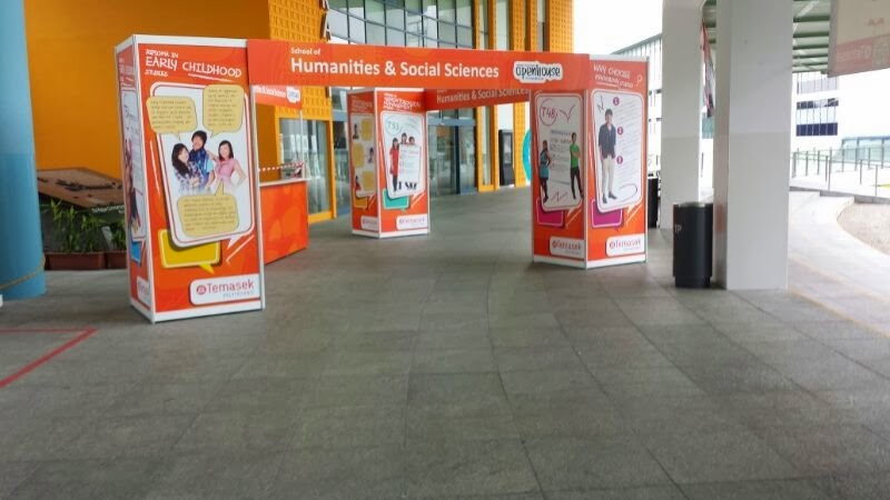
We arrived early, before the open house officially begun! All the booths were empty and it was really really quiet and deserted!


 There was a mass selfie ground, where the gigantic screen above acts as a 'camera' and will show an image of the people at the ground on it!


It started to become crowded after people started streaming in the school.


Performances which show the fun and vibrant side of TP!


The theme of the open house was ' Best Day Ever', which was shown in the T-shirts the students wore, advertisements and billboards.


One of the items they gave to visitors! All the bags they gave out has the same theme and similar design for the different schools in TP.


The shirt the students wore for the open house, it was specially designed for this event!


Now, I shall answer some questions!

•What is the THEME and the MESSAGE?
The theme of TP's open house is 'Best day ever'. The school wants to tell prospective students that the open house is definitely one of the best experiences they will ever have, and the next three years of their life will be the best days of their lives.

•Is it EFFECTIVE? What makes it effective? What worked? Why?

Well, I would say that it is effective as this theme was consistent, and emphasises that one's time at TP will be a blast, so this adds on to the fun image that TP already has.

•Do you like it? Why/Why not?

Honestly, I think that it is too cliche.To me, school is not only about fun and learning, but also about learning as well.By emphasising too much on the 'fun' side, the academic part seems to be neglected.

•What could be done to improve it? Can you suggest IMPROVEMENTS to it?

I think that it will be better if TP can focus more on how they can bring every student to their highest potential, and help them fulfil their dreams. A theme like, 'Your dreams come alive' may be better. Emphasising on how fun life is in TP is not exactly very practical, as students come to school not only to have fun, but also to study in order to get into an university or their desired job.

•Was there anything in particular that was INNOVATIVE and really caught your attention and impressed you?

What I was most impressed about the open house is that they had various activities and the students were just so friendly and enthusiastic. It actually felt like a carnival, and it had this festive vibe. This was worlds apart from SP's open house, where everything -in my own opinion- was mundane.

Would you recommend SP to use this and why?
How did it engage you?

It will be better if SP's student volunteers were more enthusiastic in promoting their courses, so that people will be persuaded to come to SP.  The energy and friendliness the TP students had was something that definitely changed my perception of the school.

•What COLLABORATIVE TOOLS did you use? 

My team used Whatsapp to discuss and share pictures together.

•Throw in your understanding of Design Principles and your take of what you observed in a very "VC" way.
See things in the light of form and function.
Does this visual language appropriate itself with the intended audience in this culture?

I think that the visual language is very suitable to the target audience, the prospective students. The design of the logo and other items they gave out all were trendy, and had interesting designs that I am pretty sure young people will like.


In all, I really enjoyed myself at the TP open house, and I am really glad that I had the opportunity to visit the school. Thanks Ms Sng for giving us such a fun task!

Thursday 9 January 2014

Mobile website design

In this interconnected world we live in, the internet is definitely something that we cannot do without. Can you imagine a day without checking your Twitter? Or how about not being able to Google something when we need to find out on say, what clothes to wear to impress the guy or girl you like? Well, the world will definitely be a very mundane place to live in, that's for sure!
Today, we can access the internet from virtually anywhere with our handheld devices, even in the bathroom!  As such, learning how to design a mobile website will definitely in handy, as it can reach out to a wide demographic.

In VC, I learnt how to design a mobile website, and here are some principles I learnt!

1) Layout is important.
 Making it as minimalistic as possible will make the page less cluttered and easier to access. Also, it is vital to minimise left/right navigation, but make it on a single column. You won't want people to keep shifting the page left and right while accessing your website, for it will make them lose interest in it after a while!

2) Less is more. Minimalistic is the way to go.
Making sentences short and straight to the point will make it easier to understand. Remember that the mobile device is small and too many words on the screen is a no-no. Also, sell your idea persuasively through action words and use a type front that is easy on the eye so that it will be easier for people to read it.

3) Coding
Use XML or XHTML, or use HTML and CSS coding if possible.

4) Pictures
Choose the most engaging and eye catching picture to use on your website. Also, use pictures sparsely as images will take forever to load on a mobile device. Well, it will save a lot of frustration for the user if the page loads faster!

5) Include page links
Use back buttons and links and make sure that all the pages are linked to other pages. This will ensure easy navigation for someone visiting your website!

6) Page size
A 750 to 800 pixel width page is the perfect page! Don't make the page bigger than the 1024 width and don't go narrower than the 750 pixel width.

There you have it, 6 golden rules to keep when designing a mobile website! Hope that it was helpful (:

Tuesday 5 November 2013

Outing to the Peranakan museum!

Often, designers draw inspiration from the things around them. They can be nature, architecture, works of art, literary works, people around them, and many more. In fact, inspiration can be found just about anywhere, even at a museum!

This trip to the Peranakan Museum was simply awe-inspiring, and I truly enjoyed myself. Though it was not my first time visiting the museum, this experience was enriching all the same.  I had fun learning about the rich culture of the Peranakans, as I found out more about this unique group of people. After watching the Channel 8 drama 'The Little Nyonya', a show about a Peranakan family, I have always thought that all Peranakans were Chinese.
But after my visit, I learnt that that there are other groups of Peranakans as well, such as the Peranakan Indians and Jawi Peranakans. What an eye-opener!

Many may think that museums are mundane places, but not for this museum! With interactive exhibits and informative displays, it was interesting discovering about the lives of the Peranakans. Well, it didn't feel like as though I was in a museum. In fact, it felt like I have stepped into a whole new world of Peranakans!

Let the pictures do the talking (:


Tableware seen in a typical Peranakan household.


Beautiful artwork on display.


A wedding ceremony
Living room of a peranakan house
Just look at the intricate design on this cabinet!
Porcelain ware owned by them.


Clothes owned by Peranakan women.

Of course, outings are never boring with my beloved class! I must say that we had a fabulous time together. Would I want to visit the Peranakan museum again? Definitely.